FinTech · Enterprise · Mobile · 2021–2022
VTB Bank — Document Management
Impact: Onboarded 3 enterprise clients within the first quarter
VTB needed to integrate a desktop-only, third-party document-signing platform into their mobile banking app for SMBs. The challenge was bridging the vendor's technical limitations with strict bank security guidelines while ensuring a seamless, native UX.
Key decision: document status filtering
The team initially proposed a single-screen document list to speed up development. Knowing the UX risks in complex B2B workflows, I pushed back. I ran moderated usability tests with 8+ business users to validate my position.
💬
70% of participants faced high cognitive load and failed to find urgent documents without filters.

The role switcher
Users frequently switch between sender and signer roles, requiring entirely different workflows. I designed a single toggle that instantly switches the context. This eliminated account-switching friction and accommodated fast multi-tasking.

Scope

50+ screens · dual-role system · error handling · edge cases
Results
I replaced slow offline paperwork with a fast mobile flow that minimized the time-to-sign loop. This solution helped onboard three major enterprise clients within the first quarter—earning executive recognition—and evolved a standard banking tool into a comprehensive business ecosystem for SMBs.
Also shipped in the same release
During discovery, we found that small enterprise clients lacked secure infrastructure to discuss document discrepancies. To prevent them from leaving for third-party messengers, I proactively designed a secure in-app chat framework, scoping and handing it off within a single sprint.

Scoped, designed, and handed off within a single sprint.
Weather · Consumer · Mobile · 2026
Rainbow AI — Rebuilding the monetization system
Map paywall — timing over gating
Paywall fired mid-drag, blocking exploration before intent was clear. Redesigned around a rule: zero forced interruptions, zero paywalls on drag.

Now/New
Quick logic prototype, built with Claude for rapid validation — UI is placeholder, the interaction is the point.
What I didn't do

Onboarding — sell the pain, not the feature
High trial-to-refund rate: users didn't see why they needed the app. Rebuilt around one pain, carried through the whole flow — a hook screen name it, an interaction proves it, and the same thread continues into the paywall copy and a founder's touch — thank you after purchase.

Results
Designed and handed off both pieces as a system, with a test plan defined (D14 conversion, dismiss rate, time-on-map, min. 2-week test vs control). The test wasn't run before I moved on.
EdTech · Mobile · End to End · 2025
Biblegram — Daily learning app
The goal was to rapidly enter the US religious app market. Operating with absolute autonomy—without research, a brief, or a defined audience—I designed and shipped the entire MVP ecosystem from scratch in under three weeks, including the brand identity, design system, onboarding, and core game loops.
Visual identity & Interface architecture
Without historical data, I built the interface around universal clarity to keep cognitive load minimal. The layout remains instantly accessible and functional for both younger and older demographics without requiring instructions.

Dynamic onboarding
I designed a lightweight onboarding flow that captures user preferences on the very first screen. This allows the app to dynamically personalize the daily experience before the user even reaches the main hub.

Turning requirements into experience
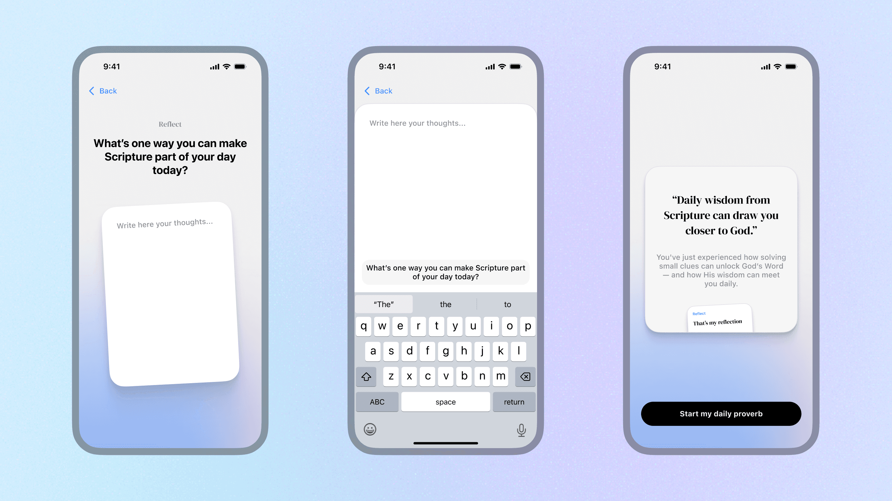
When tasked with adding a post-puzzle reflection feature to build a daily habit, the initial product layout felt disruptive. I restructured the user flow to transform this feature into a natural, emotionally satisfying conclusion to the daily gameplay loop.


Share
Users can share decoded wisdom cards directly to Instagram, WhatsApp, Telegram, and other platforms.

Results
Shipped the full MVP — brand, design system, onboarding, core loops — in under three weeks. The app went live, but usage and conversion data were never shared with me, and the project was discontinued by leadership a few months after launch.
Design system · iOS/Android · 2025
From tokens to a full component library
Starting point
Tokens for color and typography set the foundation the rest of the system builds on.


Text fields, built once
Over thirty field and card patterns — inputs, toggles, FAQ rows, notifications, practice widgets. Before, each one got redrawn per screen.

Icon set
Same grid, same weight, for every icon in the app.

WCAG checked
Components, text and background were measured with Figma's Contrast plugin, not guessed from the palette.

